Fill in before sending
[server name][app name][what it does, who it is for][iOS and Android versions][feature, one-sentence description, items on the screen][App Store link][Google Play link][company name][address][support email][phone][domain]
On my Opus Growth hosting server [server name], build a landing site for the [app name] mobile app. App: [what it does, who it is for], platforms and minimum versions: [iOS and Android versions]. The four headline features and what each screen shows: [feature, one-sentence description, items on the screen]. Plans and prices: [plan name, price, period, included features, trial length; VAT included or not]. Store links: [App Store link], [Google Play link]. Support questions: [real answers on account deletion, cancellation, data export and so on]. Company and contact: [company name], [address], [support email], [phone]. Domain: [domain]. Real screenshots: [links or "none, draw them in HTML"].
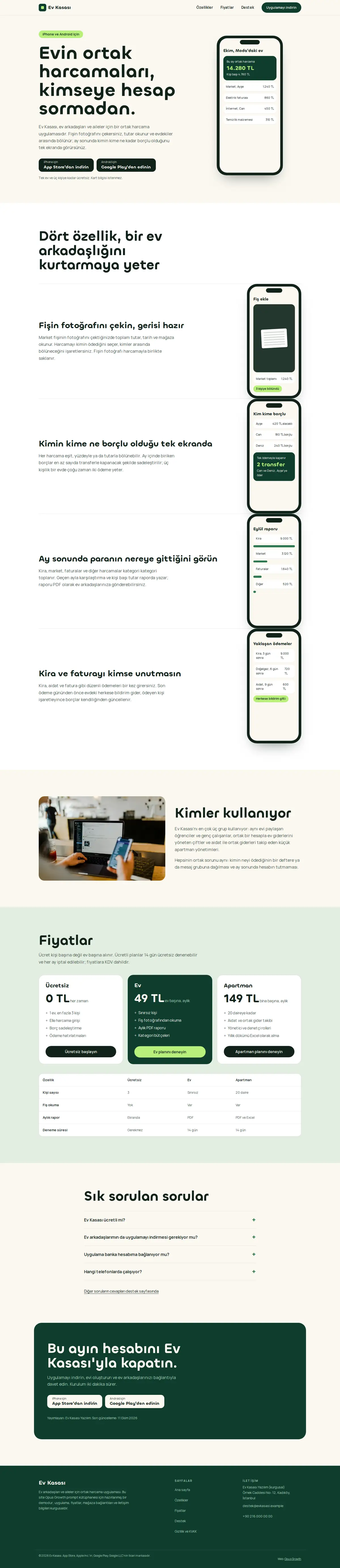
Pages: home (/: hero, phone-led feature story #ozellikler, who uses it, pricing #fiyatlar, FAQ, download call to action #indir), support (/destek/: frequently asked questions and support contact), privacy and KVKK (/gizlilik/: covering both the app and the site; the stores ask for a privacy policy URL) and 404.html. The pricing section has plan cards and a real `<table>` comparison below them; do not give the table a min-width, because in the demo a fixed minimum width pushed columns off screen on phones.
Style: a warm, trustworthy app landing page. Cream background, a dark brand colour and a single bright accent used only as a background. A rounded, friendly Fontshare display face (for example Chillax) and a readable body face (for example Manrope). Draw the phone frame in CSS (aspect-ratio 9/19, rounded corners, a notch) and build the screens in HTML and CSS instead of image files; the screen cards are aria-hidden decoration and the text next to them describes the feature. For a real app, download Apple's and Google's official badges to your own server for the store buttons and follow their guidelines; add the trademark note to the footer.
Motion rules (the hardest part, follow them to the letter):
1. Libraries: only the GSAP 3.13 core and ScrollTrigger, only on the home page. Lenis, SplitText, Swiper, Lottie and video are NOT loaded; no scripts at all on the support and privacy pages.
2. Every feature section carries its own small phone and screen in the HTML. On phones, without JS and with reduced motion each feature shows with its own screen, stacked (side by side on wider screens); that state must be complete on its own.
3. At 1024 px and wider, when motion is allowed, JS copies the screens from the sections into the single phone in the right-hand column, adds a `has-phone` class to the section and hides the small phones. Do not write the screens twice in the HTML. Because the feature section is below the first view, this class change does not count towards layout shift; the demo measured CLS 0.
4. Keep the phone in place with CSS `position: sticky` (top: calc(50vh - half the phone height)) instead of a ScrollTrigger pin. No pin-spacer is added, it works without JS and the page does not jump.
5. Screen change: for each feature section use ScrollTrigger.create with start "top 55%", end "bottom 55%" and onToggle; show the active screen with gsap autoAlpha and hide the previous one with autoAlpha 0. Do not use opacity alone; hidden screens must be visibility:hidden so the accessibility audit does not read them. The active section's heading changes colour (no fading with opacity), and dots next to the phone show which feature is active.
6. Cards and pricing boxes appear with data-reveal, sliding up 20 px on scroll; clear the copied screens in the matchMedia revert function so the layout does not break when the window is narrowed.
Setup and known traps (each one cost points or broke something in the demo measurement, do not skip any):
1. If a live site is already on the server, tell me first, because setup overwrites index.html and the assets folder. Preview scaffold_site with confirm=false and call confirm=true after my approval. Then read site_design_guide and site_seo_guide. Before writing code, put the design direction (typography, colour, grid, signature element, motion language and the libraries that will NOT be loaded) in a short ART.md outside assets and show it to me.
2. Compile Tailwind, do not load it from the CDN. Install `npm i -D tailwindcss@3` with site_run_command and background=true, and watch it with site_command_status. The content paths in `tailwind.config.js` must cover every HTML file, every template and every JS file that writes classes. `_src/tw.css` holds an `@import "../assets/app.css";` line and the three `@tailwind` lines; compile it into one file with `npx tailwindcss -c tailwind.config.js -i _src/tw.css -o assets/site.css --minify`. Remove the cdn.tailwindcss.com script and the inline tailwind.config from the pages and link only `/assets/site.css`. Recompile after every HTML change.
3. Self-host the fonts. First check that the Fontshare family you pick has the Turkish letters (ş, ğ, ı, İ, ç, ö, ü): in the demo Tanker had no dotless ı and Outfit had no ş, ğ or İ, so those letters would fall back to another font in headings. Download each weight's woff2 separately with site_fetch into `assets/fonts/`, write the @font-face rules with `font-display: swap` into `assets/app.css` (design-check looks for the custom font there) and check the font-family name in the CSS you downloaded. Preload the heading and body fonts used above the fold on every page with `<link rel="preload" as="font" type="font/woff2" crossorigin>`, before the stylesheet; do not preload more than two files, because preloading a third weight in the demo made mobile LCP 0.2 seconds longer. Most Fontshare fonts lack the ₺ sign, so write "TL" for prices.
4. Make the menu and footer static HTML. Do not load chrome.js or site.config.js on the pages. Write a small `chrome-stamp.mjs` that reads the nav list from site.config.js and stamps `_src/header.tpl` and `_src/footer.tpl` between the `<!-- nav:start --><!-- nav:end -->` and `<!-- footer:start --><!-- footer:end -->` markers on every page, adding aria-current="page" to the active link. Templates must not end in .html and must use placeholders like `[[NAV]]` instead of `{{...}}`. Build the mobile menu without JS using `<details>`. Keep the organisation name, address and phone as plain text in the footer, and make every touch target at least 44x44 px, footer and breadcrumb links included.
5. Convert images while downloading them with site_fetch: write the same photo with resize="480x", "800x" and "1200x", image_format="webp", quality=65 to separate files. site_fetch never crops; when an Unsplash photo needs another ratio, download the cropped version by adding parameters such as `?w=1600&h=1200&fit=crop` to its URL. Give every `<img>` srcset, sizes and a width and height that match the real ratio. The main above-the-fold image gets fetchpriority="high" and is not lazy; the others get loading="lazy" decoding="async". If the main image fills the screen on mobile, serve a smaller crop with `<picture>`.
6. Write the SVG version of the logo as favicon.svg with site_write_file and add `<link rel="icon" href="/favicon.svg" type="image/svg+xml">` to every page. Without a favicon the browser logs a 404 and Best Practices drops to 96.
7. HTML validator rules: start with an upper-case `<!DOCTYPE html>`, use ` ` for the spaces in the visible text of tel: links, never use a style="" attribute, give every button type="button", and do not put a `<details>` inside a `<figure>` after its figcaption.
8. Download the motion libraries (GSAP, ScrollTrigger) from jsdelivr into `assets/vendor/` with site_fetch, pin the version and load them only on the home page. Do not use `<script defer>`; put a small loader at the end of the page that waits for the load event, two requestAnimationFrame calls and then requestIdleCallback, and appends the scripts in order with async=false. A one-line script in `<head>` adds the `js` class to `<html>` and the `anim` class unless prefers-reduced-motion is "reduce"; without `anim` the loader downloads nothing. Define hidden start states only under `.anim`, and add a CSS animation as a safety net that reveals every hidden element after 2.5 seconds in case the library never arrives. In earlier demos deferred libraries pushed mobile LCP to 3.2 seconds; with this loader the pages measured 99 to 100. Name the attribute for scroll-revealed elements data-reveal; design-check only recognises motion by that name.
SEO, AEO and GEO:
1. Use directory-style URLs with a trailing slash (/destek/, /gizlilik/). Fill in the seo block of site.config.js and run `node seo-stamp.mjs`. Write the page-specific schema (home WebPage, MobileApplication (operatingSystem, applicationCategory, both store URLs as downloadUrl, the plans I gave as offers with TRY prices; do NOT add aggregateRating, because a store rating is not a review collected on your site) and FAQPage; support WebPage and FAQPage; privacy WebPage; BreadcrumbList on inner pages. For a software company without a physical shop, localBusiness:false in site.config.js) in separate `<script type="application/ld+json">` blocks and link them to the base graph by @id. Do not nest BreadcrumbList inside @graph; keep it in its own block, because that is the only way seo-check sees it.
2. Keep titles at 60 characters or fewer (seo-check flags anything over 65 as an error), descriptions between 120 and 158 characters, one h1 per page and no skipped heading levels (an h3 straight after the h1 dropped accessibility to 98). Every page needs at least 150 words of main content; contact and privacy pages tend to fall short.
3. The first paragraph of every page answers the page's question directly. Write page-specific FAQs with `<details>` and mark them up as FAQPage. Show the publishing organisation and a "Last updated" date in `<time>`.
4. In robots.txt, write down and justify your decision for GPTBot, OAI-SearchBot, ChatGPT-User, ClaudeBot, Claude-User, Claude-SearchBot, PerplexityBot, Perplexity-User, Google-Extended, Applebot-Extended, Bingbot and CCBot, and point to the sitemap. Give sitemap.xml real lastmod dates. llms.txt holds an accurate two-sentence summary of the site, the key facts and a list of the important pages.
5. No invention: do not write reviews, ratings, awards, customer counts, certificates, opening hours, coordinates or prices without asking me. Leave any field you do not know out of the schema entirely.
Gates (in order; do not say "done" until all pass):
1. With site_run_command run `node chrome-stamp.mjs`, the Tailwind build, `node seo-stamp.mjs`, `node seo-check.mjs` (0 errors, 0 warnings), `node design-check.mjs` (0 errors; justify any remaining warning) and `npx html-validate "**/*.html"` (0 errors).
2. View every page with site_preview using view="mobile" and view="desktop". site_preview captures the page with motion turned off (reduced-motion); if content is missing in that capture, the motionless state is broken. Lazy images further down may be blank in the full-page capture; do not count that as an error, but check their paths.
3. Run core_web_vitals with strategy="mobile" and strategy="desktop" for every page. Acceptance: on mobile Performance at least 95 and Accessibility, Best Practices and SEO 100; on desktop all four at least 95. For a page that misses, find the slow file with resources=true, fix it and measure again. Then run seo_audit on the home page with strategy="mobile" and runs=2. No address outside your own domain may remain in the network request list.
4. No horizontal scrolling at 360, 390, 768 and 1440 px, touch targets of at least 44 px and no console errors. The site must also look flawless inside a 390x790 and a 1440x898 frame, as on the prompt pages.
Motion check: site_preview cannot show motion, so tell me what to look for in my own browser. On desktop, when you reach the Features section the phone should stay fixed in the middle of the screen on the right, its screen should switch to each feature as that heading reaches the middle, the heading should take colour and the dot beside it should advance. On a phone and with reduce motion on, each feature shows its own small screen and nothing is fixed in place. The store buttons must open the right store.
After publishing: preview the `/assets/* Cache-Control: public, max-age=31536000, immutable` rule with site_headers and apply it after my approval; from then on, version the file name whenever CSS or JS changes (site-v2.css and so on). Submit sitemap.xml with gsc_submit_sitemap and check the home page with gsc_url_inspect. Finally give me: a per-page score table (page, four mobile scores, four desktop scores, LCP, CLS), the gate results, the result of the interactions you tried in a browser and the list of fixes you applied.