Fill in before sending
[server name][product name][what it does and for whom, one sentence][six features, one sentence each][links to three screenshots and what each one shows][logo files or "none"][approved quote, name, title, company or "none"][legal name][address][phone][email][WhatsApp number]
On the [server name] site on my Opus Growth hosting server, build a static, fast marketing site for my software product [product name] that feels like the modern SaaS templates on Webflow, without using Webflow. Product: [what it does and for whom, one sentence]. Key features: [six features, one sentence each]. App screenshots: [links to three screenshots and what each one shows]. Plans: [plan names, monthly and yearly prices, whether VAT is included, what each plan includes]. Customer logos I have written permission to show: [logo files or "none"]. Customer quotes: [approved quote, name, title, company or "none"]. Company: [legal name], [address], [phone], [email], [WhatsApp number]. Sign-up or demo path: [sign-up page URL or "demo requests by WhatsApp and email"]. Domain: [domain].
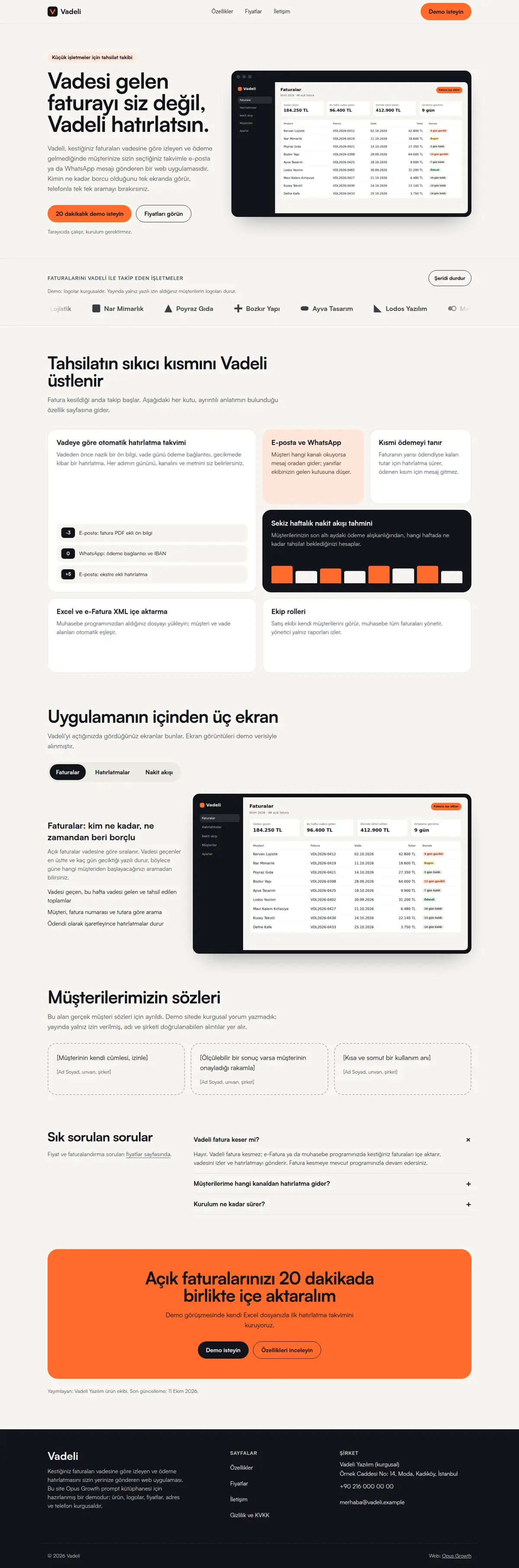
Pages: home (hero with a product screenshot, logo strip, bento feature grid, tabbed product showcase, customer quotes, FAQ, closing call to action), features (/ozellikler/, each feature with its own heading and anchor), pricing (/fiyatlar/: toggle, plan cards, comparison table, billing FAQ), contact (/iletisim/, no form; email, WhatsApp with a prefilled message and phone), privacy (/gizlilik/) and 404.html.
Style: light-background modern SaaS. If no [colour preference] is given, a warm off-white background, ink-black text and a single bright accent (used only as a background, with dark text on it). Two weights of one Fontshare family (for example Satoshi 400 and 700). Large rounded bento tiles, pill buttons, the product screenshot in a dark window frame. No purple-to-blue gradients and no glass effect everywhere.
Interaction rules (Webflow interactions without a library):
1. GSAP, Lenis and Swiper are NOT loaded. Write the interactions in CSS plus a single vanilla JS file of at most 3 KB, loaded with defer on the home page only. The pricing toggle needs no script.
2. Bento grid: a 4-column CSS grid on desktop, one tile 2x2 and two tiles 2 columns wide, arranged so no cell is left empty; one column on mobile. Each tile carries a real link to the matching heading on the features page and the whole tile is clickable: give the link an ::after with inset:0 (a stretched link) and do not put a second link in the tile. On hover and :focus-within the border darkens, the tile rises 4 pixels with transform and the small UI fragment inside moves (a step list slides sideways, bars grow with scaleY).
3. The logo strip uses only logos of customers who gave written permission; if there are none, leave the section out and do not replace it with fictional logos or an invented "integrations" list. The strip is two copies of the same list (the second with aria-hidden="true") moving with a CSS @keyframes translate3d(-50%, 0, 0); it pauses on hover and focus. Because the motion lasts longer than five seconds, WCAG 2.2.2 requires a "Pause strip" button: the button is hidden in the HTML, JS reveals it and updates aria-pressed and its label. Give the row that holds the button a min-height equal to the button's height; in the demo the row grew when the button appeared and a small shift (CLS 0.002) was measured on desktop. With prefers-reduced-motion the animation stops, the copy is hidden and the logos become a static wrapping grid.
4. Tabbed product showcase: in the HTML the tabs are in-page links to the panels (href="#ekran-x") and all three panels are visible one under the other, so the content is complete with JS off and for crawlers. Give the tab container role="group" and an aria-label. JS turns them into role="tablist", "tab" and "tabpanel", manages aria-selected, aria-controls, tabindex and hidden, supports the left and right arrows, Home and End, and selects the matching tab when the page opens with #ekran-x. The panels sit below the first screen, so hiding them causes no layout shift; panel images use loading="lazy".
5. The pricing toggle works without JS: two radio buttons in a fieldset (Monthly checked by default) and rules such as `.pricing:has(#donem-yillik:checked) .price-m { display: none }` that reveal the yearly prices. Hide the radio visually but keep the whole label clickable and keyboard focusable; show the focus ring with `label:has(input:focus-visible)`. In the monthly view each plan shows a "Billed yearly: X TL" line, so both prices exist in the text.
6. Customer quotes only come from approved quotes that can be verified by name, title and company. If you have none, remove the section; if you use one during drafting, make it a dashed placeholder card that says it will be filled when a real quote arrives, and ask me before publishing. Do not write Review or aggregateRating schema.
7. The hero product screenshot is the desktop LCP element: fetchpriority="high", not lazy, with sizes giving its real width. On mobile the LCP is usually the heading text; the screenshot should still load its 480 pixel version through srcset.
Schema: SoftwareApplication on the home and pricing pages (name, applicationCategory "BusinessApplication", operatingSystem, url, image, publisher and one Offer per plan and billing period: name, price, priceCurrency "TRY", url). Google requires a rating or review for the software app rich result; without genuine reviews collected on your own site no stars will show, and that must not be solved with an invented rating. FAQPage on the home, features and pricing pages, ContactPage on contact, BreadcrumbList on inner pages. The first paragraph of the pricing page answers directly: "[product name] pricing starts at N TL per month". The comparison table is a real `<table>` and scrolls sideways on narrow screens inside `<section tabindex="0" aria-label="...">`; in the demo a div with role="region" triggered prefer-native-element, and two sections labelled by the same heading triggered unique-landmark.
Setup and known pitfalls (each one cost points in the demo measurements, do not skip any):
1. If a site is already live on the server, tell me first, because setup overwrites index.html and the assets folder. Preview scaffold_site with confirm=false, and call it with confirm=true only after I approve. Then read site_design_guide and site_seo_guide. Before writing code, put the design direction (typography, colours, grid, signature element, motion language and the libraries that will NOT be loaded) in a short ART.md file outside assets and show it to me.
2. Compile Tailwind, do not load it from the CDN. Install it with site_run_command and background=true (`npm i -D tailwindcss@3`) and follow it with site_command_status. The content paths in `tailwind.config.js` must cover every HTML file, the `_src` templates and any JS file that writes classes. `_src/tw.css` holds the line `@import "../assets/app.css";` plus the three `@tailwind` lines; compile it into a single file with `npx tailwindcss -c tailwind.config.js -i _src/tw.css -o assets/site.css --minify`. Remove the cdn.tailwindcss.com script and the inline tailwind.config from every page and link only `/assets/site.css`. Recompile after every HTML change.
3. Host the fonts yourself. Read the CSS of the Fontshare family you chose, download each weight's woff2 separately with site_fetch into `assets/fonts/`, and write the @font-face rules with `font-display: swap` into `assets/app.css`, which is where design-check looks for a custom font. Check the font-family name in the downloaded CSS and confirm the family has the Turkish letters ı, İ, ş and ğ (Tanker has no ı). Preload EVERY weight used in the first screen with `<link rel="preload" as="font" type="font/woff2" crossorigin>`, placed before the stylesheet line; if that is more than three files, use fewer weights. In the demo a single body weight that was not preloaded pushed mobile LCP to 2.6 seconds and Performance down to 97. Most Fontshare fonts lack the ₺ sign, so write prices with "TL".
4. Make the menu and footer static HTML. Do not load chrome.js, motion.js or site.config.js on the pages. Write a small `chrome-stamp.mjs` that reads the nav list from site.config.js and stamps `_src/header.tpl` and `_src/footer.tpl` between the `<!-- nav:start --><!-- nav:end -->` and `<!-- footer:start --><!-- footer:end -->` markers on every page, adding aria-current="page" to the active link. Use placeholders like `[[NAV]]` instead of `{{...}}` and do not give the templates an .html extension, otherwise design-check and seo-check treat them as half-finished pages. Build the mobile menu with a JS-free `<details>`. Keep the business name, address and phone as plain text in the footer, and make footer and breadcrumb links at least 44 pixels tall.
5. Convert images while fetching them with site_fetch: write the same image as separate files with resize="480x", "800x" and "1200x", image_format="webp", quality=60 (site_fetch does not crop, so request the source at the ratio you need). Give every `<img>` srcset, sizes and width and height that match the real ratio. The image that is the page's LCP element gets fetchpriority="high" and is not lazy; every other image gets loading="lazy" decoding="async". If an image fills the first mobile screen, serve a smaller crop to mobile with `<picture>`.
6. Add `<link rel="icon" href="/favicon.svg" type="image/svg+xml">` to every page and make a 180 pixel apple-touch-icon from the logo with site_fetch and resize="180x180". Without a favicon link the browser requests /favicon.ico, logs a 404 and Best Practices drops to 96.
7. HTML validator rules: start each document with an uppercase `<!DOCTYPE html>`; every space in the visible text of a tel: link must be ` `, including the one after a prefix such as "Call: 0212..."; do not use style=""; give every button a type; put aria-label only on landmarks, forms or interactive elements (on a ul or a role-less div it was an error); never label two landmarks with the same name; leave no trailing whitespace.
8. Do not skip heading levels: on a list page, card titles as h3 straight after the h1 dropped Accessibility to 98. When you reuse a card, set its heading level per page (h2 on a list page, h3 inside an h2 section).
9. Name the motion attribute data-reveal (design-check only recognises motion by that name). JS gives the hidden starting state only to blocks that are below the screen when the page opens, and never hides first-screen content; use transform, because fading with opacity lowers the contrast audit. Put the attribute on the block that wraps a heading and its description, not on the heading alone; in the demo a waiting heading slid over the paragraph below it. With prefers-reduced-motion: reduce nothing is hidden and animations are off.
SEO, AEO and GEO:
1. Use directory-style URLs with a trailing slash. Fill the seo block of site.config.js and run `node seo-stamp.mjs`. Write page-specific schema in separate `<script type="application/ld+json">` blocks linked to the base graph with @id. Do not nest BreadcrumbList inside @graph; keep it in its own block, which is the only way seo-check sees it.
2. Titles at most 60 characters (seo-check flags anything under 25 or over 65 as an error), descriptions 130 to 158 characters, one h1 per page, and at least 150 words of main content on every page. Contact, privacy and list pages tend to fall short; add page-specific information, not filler.
3. The first paragraph of every page answers the page's question directly. Write page-specific FAQs with `<details>` and mark them up as FAQPage. Show the publisher and a "Last updated" date in a `<time>` element.
4. In robots.txt, write your decision with a reason for GPTBot, OAI-SearchBot, ChatGPT-User, ClaudeBot, Claude-User, Claude-SearchBot, PerplexityBot, Perplexity-User, Google-Extended, Applebot-Extended, Bingbot and CCBot, and point to the sitemap. sitemap.xml carries real lastmod dates. llms.txt holds an accurate two-sentence summary of the site and a list of the important pages.
5. No fabrication: do not write reviews, ratings, awards, customer counts, certificates, opening hours, coordinates or prices without asking me. Leave any field you do not know out of the schema entirely.
Gates (in order; do not say "done" until all pass):
1. With site_run_command run `node chrome-stamp.mjs`, the Tailwind build, `node seo-stamp.mjs`, `node seo-check.mjs` (0 errors, 0 warnings), `node design-check.mjs` (0 errors; justify any remaining warning) and `npx html-validate "**/*.html"` (0 errors).
2. View every page with site_preview, view="mobile" and view="desktop". site_preview captures the page with motion off (reduced-motion); if content is missing in that capture, the static state is broken. In full-page captures, fixed elements such as a sticky bar can appear mid-page and lazy images further down can be blank; do not count those as errors, but check their paths.
3. Run core_web_vitals for every page with strategy="mobile" and strategy="desktop". Acceptance: on mobile Performance at least 95 (target 99 to 100) and Accessibility, Best Practices and SEO 100; on desktop all four at 100. For a page that misses, use resources=true to find the file that delays it, fix it and measure again. Then run seo_audit on the home page with strategy="mobile" and runs=2. No address outside your own domain may remain in the network request list.
4. No horizontal scrolling at 360, 390, 768 and 1440 pixels wide, touch targets at least 44 pixels, no console errors.
Interaction check: site_preview cannot show hover or motion. Tell me how to check in a desktop browser that the bento tiles rise on hover and on Tab focus, that the "Pause strip" button stops the strip, that the tabs switch with the arrow keys, that the pricing toggle shows yearly prices even with JavaScript off, and that on a phone with reduced motion the logos become a static grid.
After publishing: preview the rule `/assets/* Cache-Control: public, max-age=31536000, immutable` with site_headers and apply it once I approve; from then on, version the file name whenever CSS or JS changes (site-v2.css and so on). Submit sitemap.xml with gsc_submit_sitemap and check the home page with gsc_url_inspect. At the end give me: a page-by-page score table (page, four mobile scores, four desktop scores, LCP, CLS), the result of each gate and the list of fixes you applied.