Fill in before sending
[AI product name][server name][what it does, for whom][three steps][4 to 6 features][trial length, sign-up URL][email][phone][WhatsApp number][address][domain][colours, or "you choose"]
Build a multi-page product site with an aurora background, frosted glass cards and light and dark themes for [AI product name] on the [server name] site on my Opus Growth hosting server. Product: [what it does, for whom]. How it works: [three steps]. What it produces or does: [4 to 6 features]. Data and security: [where data is stored, for how long, whether it is used for model training]. Trial or sign-up path: [trial length, sign-up URL]. Contact: [email], [phone], [WhatsApp number], [address]. Domain: [domain]. Brand colours: [colours, or "you choose"]. Product screenshots or photos: [links, or "none"].
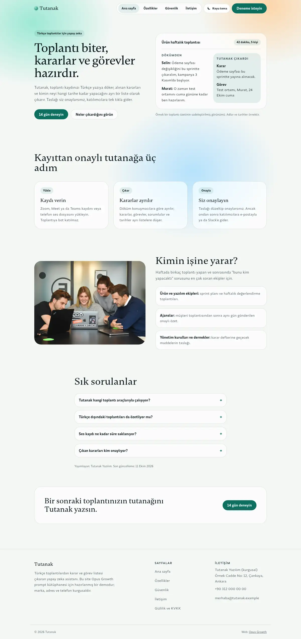
Pages: home (/), features (/ozellikler/), security (/guvenlik/), contact (/iletisim/), privacy (/gizlilik/) and 404.html. Home sections in order: hero (h1, two-sentence intro, two buttons and the product card that is the signature element), three steps, who it is for (with a photo), FAQ and a closing call to action. For AI products the security page is half of the buying decision; state retention, access and model training plainly. No form on the contact page, because the server only serves static files.
Style: aurora and glass. A soft, multi-coloured light drifting slowly in the background (the aurora), with the content on frosted glass cards. No purple to blue palette; choose three soft tones that suit the brand, such as mint, apricot and ice blue. Typography: a soft serif display from Fontshare (for example Gambetta 500) with a calm body face (for example Synonym 400 and 600). Use the glass effect on card surfaces only; do not drown the page in glass. No canvas, WebGL, video, GSAP, Lenis or Swiper. The only JavaScript is a small inline theme toggle. Signature element: a glass card in the hero with a real HTML example of what the product does (for example a decision and a task extracted from a meeting transcript).
Aurora, glass and theme rules (where this style most easily breaks performance and contrast):
1. Make the aurora in pure CSS: one aria-hidden `position: fixed` layer, two pseudo-elements (::before and ::after) and three large radial-gradients inside them. Animate with transform only (translate3d, rotate, scale) on a 25 to 35 second `alternate` loop and add `will-change: transform`. Do not animate the gradient itself, background-position or filter: blur; those repaint every frame. Put the animation inside `@media (prefers-reduced-motion: no-preference)`; with reduced motion the aurora stops but stays visible.
2. Define the colours as CSS variables (--bg, --fg, --mute, --line, --card, --solid, --acc, --accfg and the aurora tones) and point the Tailwind colours at them (for example colors: {bg: "var(--bg)"}). Write the dark values under both `:root[data-theme="dark"]` and `@media (prefers-color-scheme: dark) { :root:not([data-theme="light"]) }`, so the system theme applies even with JavaScript off.
3. Theme toggle: a one-line script in `<head>`, after the stylesheet, reads the saved choice from localStorage, writes data-theme on `<html>` and adds the `js` class; because it runs before the first paint, the page never flashes in the wrong theme. Wrap the localStorage access in try. A small script at the end of the page switches the theme on click, saves the choice and updates the button when the system theme changes. The button is a real `<button type="button">` with `aria-pressed` true while dark is on, and it keeps its accessible name ("Dark theme") even when only the icon shows on mobile. Hide the button without JavaScript (`html:not(.js) .theme-toggle { display: none }`). Also add `<meta name="color-scheme" content="light dark">`.
4. Keep the glass card in one `.glass` class: a solid background first (--solid), then inside `@supports (backdrop-filter: blur(1px))` a translucent background with `backdrop-filter: blur(18px) saturate(140%)` (with the -webkit- prefix for Safari). Under `@media (prefers-reduced-transparency: reduce), (prefers-contrast: more)` the card turns solid and the aurora is hidden. Do not use the backdrop-blur utility in the HTML; design-check warns about "glassmorphism everywhere" when it sees more than five on a page.
5. Measure contrast in BOTH themes. Lighthouse only audits the light theme; if you do not check dark separately, faint text in dark mode slips through. Make the card's translucent background opaque enough to keep text above 4.5:1 even over the brightest aurora colour (in the demo, white at 66 percent in light and dark green at 58 percent in dark). Switch the accent button's text colour per theme (white on dark pine in light, dark green on pale mint in dark).
6. Give the hero card its entrance with transform only and a data-reveal attribute (design-check recognises motion by that attribute); never hide or fade the h1, because it is the LCP element.
Setup and known traps (each one cost points or failed a gate in the demo measurement, do not skip):
1. If a site is already live on the server, tell me first, because setup overwrites index.html and the assets folder. Preview scaffold_site with confirm=false first, then call confirm=true once I approve. Then read site_design_guide and site_seo_guide. Before writing code, write the design direction (typography, colour, grid, signature element, motion language and the libraries that will NOT be loaded) into a short ART.md outside assets and show it to me.
2. Compile Tailwind, do not load it from the CDN. Install `npm i -D tailwindcss@3` with site_run_command and background=true, and follow it with site_command_status. The content paths in `tailwind.config.js` must cover every HTML file including subfolders, the `_src/*.tpl` templates and any JS file that writes classes. `_src/tw.css` holds the line `@import "../assets/app.css";` and the three `@tailwind` lines; compile it into one file with `npx tailwindcss -c tailwind.config.js -i _src/tw.css -o assets/site.css --minify`. Remove the cdn.tailwindcss.com script, the inline tailwind.config, chrome.js and motion.js from the pages and link only `/assets/site.css`. Recompile after every HTML change. Because the theme colours are variables, Tailwind's opacity shorthands (such as bg-fg/50) do not work; define a separate variable if you need a translucent colour.
3. Self-host the fonts. Read the Fontshare CSS with one request per family and weight (`https://api.fontshare.com/v2/css?f[]=family@weight`), download each woff2 file into `assets/fonts/` with site_fetch and write the @font-face rules with `font-display: swap` into `assets/app.css`; design-check looks for the custom font there. Preload EVERY weight used above the fold (heading, body and buttons) on every page with `<link rel="preload" as="font" type="font/woff2" crossorigin>` and put these lines before the stylesheet link. Most Fontshare fonts have no ₺ sign, so write prices with "TL".
4. Make the menu and footer static HTML. Write a small `chrome-stamp.mjs` that reads the nav list from site.config.js and stamps `_src/header.tpl` and `_src/footer.tpl` between the `<!-- nav:start --><!-- nav:end -->` and `<!-- footer:start --><!-- footer:end -->` markers on every page, adding aria-current="page" to the active link. Do not give the templates a .html extension and use placeholders like `[[NAV]]` instead of `{{...}}`. Build the mobile menu with `<details>` and no JS. Keep the business name, address and phone in the footer as plain text, and make footer and breadcrumb links at least 44 pixels tall.
5. Convert images while downloading them with site_fetch: write the same photo to separate files with resize="480x", "800x" and "1120x" (or the widths the page needs), image_format="webp" and quality=65. Give every `<img>` srcset, sizes and a width and height that match the real ratio. The main above-the-fold image gets fetchpriority="high" and is not lazy; give fetchpriority only to the real LCP element, and loading="lazy" decoding="async" to the rest.
6. Write a small `favicon.svg` in the site root and add `<link rel="icon" href="/favicon.svg" type="image/svg+xml">` to every page; if there is a PNG logo, make an apple-touch-icon with site_fetch, resize="180x180" and image_format="png". Without a favicon the browser logs a 404 for /favicon.ico and Best Practices drops to 96.
7. HTML validator rules: start every document with an uppercase `<!DOCTYPE html>`, quote attributes with double quotes, use ` ` for the spaces in the visible text of tel: links, never use a style="" attribute (if you need a CSS variable, use a Tailwind arbitrary property class such as `[--r:-4deg]`), give every button type="button", do not put aria-label on role-less elements such as `<ul>` or `<div>`, and use `<section aria-label="...">` instead of role="region".
SEO, AEO and GEO:
1. Use directory-style URLs with a trailing slash (/ozellikler/, /guvenlik/, /iletisim/, /gizlilik/ or their equivalents in your language). Fill in the seo block of site.config.js and run `node seo-stamp.mjs`. For a software company with no physical shop, set localBusiness:false in site.config.js. Page schemas: home WebPage and FAQPage; features SoftwareApplication (applicationCategory, operatingSystem, featureList) and FAQPage; security WebPage and FAQPage; contact ContactPage; BreadcrumbList on inner pages. Do not list a security certificate or compliance document you do not hold; if you hold one, give its number and validity date. Write every page-specific schema in its own `<script type="application/ld+json">` block and link it to the base graph with @id. Do not nest BreadcrumbList inside @graph; keep it in its own block, because that is the only way seo-check sees it.
2. Titles 48 to 60 characters (seo-check treats over 65 as an error), descriptions 145 to 158 characters, one h1 per page. The main content of every page is at least 150 words. In the demo the contact and privacy pages came in at 84 and 116 words on the first try and were completed with real information such as "what happens during the trial" and "who the data is shared with".
3. The first paragraph of every page answers the page's question directly, and the h1 is phrased as that question. Write the page's own FAQ with `<details>` and mark it up as FAQPage. Show the publishing organisation and a "Last updated" date with `<time datetime>`.
4. In robots.txt, write your decision with the reason for GPTBot, OAI-SearchBot, ChatGPT-User, ClaudeBot, Claude-User, Claude-SearchBot, PerplexityBot, Perplexity-User, Google-Extended, Applebot-Extended, Bingbot and CCBot, and point to the sitemap. sitemap.xml has a real lastmod. llms.txt has an accurate two-sentence summary of the site and a list of the important pages.
5. No invention: do not write reviews, ratings, awards, customer counts, certificates, opening hours, coordinates, prices or product figures without asking me. Leave any field you do not know out of the schema entirely.
Gates (in order; do not say "done" until all pass):
1. With site_run_command, run in order `node chrome-stamp.mjs`, the Tailwind build, `node seo-stamp.mjs`, `node seo-check.mjs` (0 errors, 0 warnings), `node design-check.mjs` (0 errors; justify any remaining warning) and `npx html-validate "**/*.html"` (0 errors).
2. View every page with site_preview, view="mobile" and view="desktop". site_preview captures the page with motion turned off; if the content is not complete in that capture, the no-motion state is broken. Lazy images further down may be blank in a full-page capture; do not count that as an error, but check their paths. Check the dark theme too: since site_preview cannot change the system theme, run a contrast audit in dark mode (for example axe-core's color-contrast rule with prefers-color-scheme: dark), or make dark the default temporarily and preview it once.
3. Run core_web_vitals for every page with strategy="mobile" and strategy="desktop". Acceptance: on mobile Performance at least 95 and Accessibility, Best Practices and SEO at 100; on desktop all four at least 95, target 100. For a page that misses, find the slow file with resources=true, fix it and measure again. Then run seo_audit on the home page with strategy="mobile" and runs=2. The network request list must contain no address outside your own domain (store and WhatsApp links are links, not requests).
4. No horizontal scrolling at 360, 390, 768 and 1440 pixels wide, touch targets at least 44 pixels, no console errors.
Interaction check: since site_preview cannot run motion or switch themes, tell me what to look for in my own browser: the light in the background drifts very slowly; clicking the toggle switches the theme, the choice survives a page change and the page never flashes in the other theme while loading; if the operating system is in dark mode the site opens dark; with reduce motion on the aurora stops; with reduce transparency on the cards turn solid; with JavaScript off the toggle is hidden but the system theme still applies.
After publishing: preview the rule `/assets/* Cache-Control: public, max-age=31536000, immutable` with site_headers and apply it once I approve; from then on, version the file name whenever CSS or JS changes (site-v2.css and so on). Submit sitemap.xml with gsc_submit_sitemap and check the home page with gsc_url_inspect. At the end give me: a per-page score table (page, four mobile scores, four desktop scores, LCP, CLS), the gate results and the list of fixes you applied.